ACB ONE is a secure and reliable digital banking application widely used for daily financial transactions. Through long-term usage and behavioral observation, I identified several friction points that impact user confidence and task efficiency - particularly in high-frequency interactions. This case study focuses on refining system feedback, reducing interaction cost, and improving post-transaction workflows - while preserving strict banking security standards.
The experience reveals two core UX challenges:
When users tap the application icon, the sequence unfolds as follows:
App icon tapped
This delay happens before users can access any features. In a financial product, the entry moment is critical. It sets the tone for reliability, control, and security. When the system remains static for an extended period, uncertainty begins to build before interaction even starts. The issue here is not purely technical - it is experiential.
In digital products today, speed is not a luxury. It is a baseline expectation. Users generally expect immediate or near-immediate system response when opening an app. When the startup duration extends beyond several seconds - especially without feedback - it disrupts flow and weakens perceived competence.
In this case, the startup state includes:
This creates a silent wait state. In high-trust environments such as banking, silence can easily be interpreted as instability. And perceived instability directly affects trust.
To verify whether this perception was subjective, I collected recent public user reviews regarding startup performance. Below are unedited screenshots of recurring feedback:
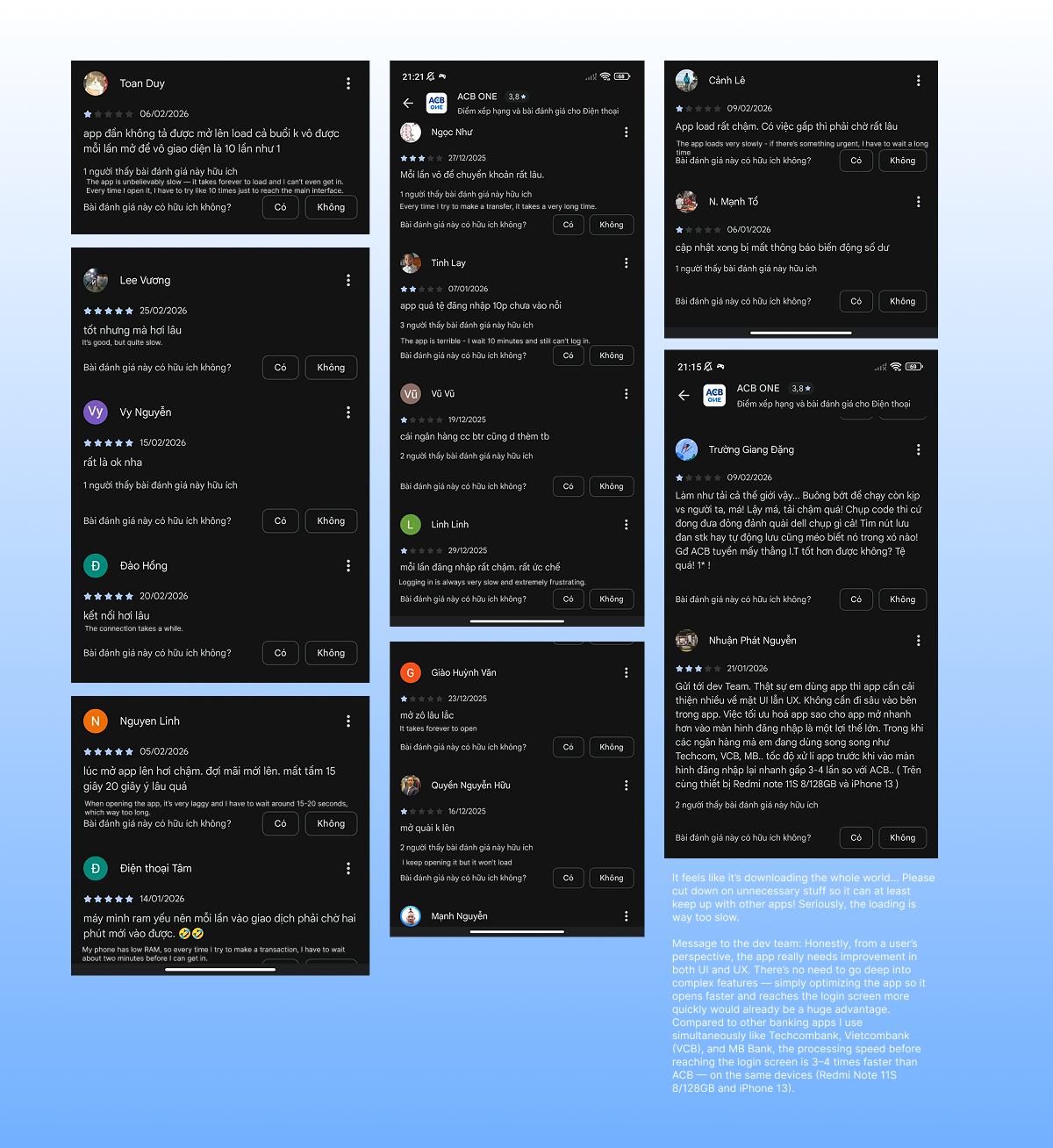
Across these reviews, several patterns consistently appear:
Users repeatedly describe the app as:
Some explicitly compare loading speed to other banking applications, noting that competitors reach the login screen significantly faster. Three clear signals emerge:
The delay is described as frequent, not occasional.
Users are benchmarking speed against other banking apps, which positions the issue as a competitive disadvantage.
The frustration occurs before login - meaning dissatisfaction forms before any transaction or task begins. Notably, most feedback criticizes speed, not interface design. This distinction is important. The primary issue is performance. However, the absence of feedback during the waiting period likely intensifies perceived slowness.
The root cause of prolonged startup time is likely related to system architecture and backend process.
Addressing actual loading speed would require technical optimization beyond the scope of this redesign exploration. This project does not attempt to justify the delay. Nor does it present visual treatment as a substitute for engineering improvement. Instead, it focuses on a narrower but meaningful question: If waiting cannot be eliminated immediately, can its psychological impact be reduced?
This defines the UX intervention boundary. Backend optimization improves real speed. UX intervention improves perceived stability. Both matter - but they operate at different layers.
The most critical experiential gap is not just duration. It is silence. During the 20-30 second startup window, users receive no indication that progress is occurring. This increases the likelihood that they:
To address this, the redesigned introduces a subtle mascot animation immediately upon launch.
The animation includes:
Mascot used for conceptual exploration only. All rights belong to ACB Bank
The objective is not to mask slow performance. The objective is to:
The waiting time remains unchanged. But the experience shifts from silence to communication. In financial products, communication during delay is a form of reassurance. And reassurance reinforces trust.
It is important to distinguish between actual waiting time and perceived waiting time. Actual waiting time refers to the measurable duration (20-30 seconds before login appears).
Perceived waiting time, however, is shaped by:
When a system remains static, users interpret the delay as longer than it objectively is. Silence increases uncertainty, and uncertainty amplifies frustration.
Conversely, when feedback is present - even if the duration remains unchanged - users experience:
In other words: The animation does not reduce the actual loading time. It reduces the psychological weight of the loading time. This distinction is critical. The intervention addresses emotional stability during unavoidable delay, while acknowledging that technical optimization remains the long-term priority.
Reducing interaction cost for everyday financial checks
Not every session in a banking app begins with a transaction. In daily usage, many interactions are informational rather than transactional. Users frequently open the app to:
SMS notifications typically inform users that something happened. They rarely provide full financial context. As a result, users return the banking app not to act - but to confirm. The app becomes a reassurance tool. And reassurance is a high-frequency behavior.
In the current experience, every interaction requires full authentication: Open app → Login → Navigate → Access Balance
This structure is secure - but it treats every intent equally. Through personal long-term usage and observation, a clear behavioral pattern emerges: Users often open the app immediately after receiving an SMS notification - not to perform actions, but simply to verify financial status. This creates repeated micro-friction:
The intention is small. The process is heavy. Over time, this mismatch increases interaction cost and cognitive load.
The goal is not to weaken security. The goal is to align access level with user intent. Checking balance or recent transaction summaries carries significantly lower risk than:
Instead of binary access (locked vs fully unlocked), the system can introduce layered visibility. Can informational reassurance exist before full authorization?
To explore this opportunity, I redesigned the login screen to include a lightweight notification layer. This small feature introduces a contextual notification icon directly on the login interface. It indicates:
The purpose is not to expose full financial data. The purpose is to surface high-level context. Users can immediately see that something has changed - and then decide whether deeper access is necessary.
The preview layer is intentionally limited:
Security remains intact. Transactional authority remains protected. The design introduces progressive disclosure instead of full exposure.
SMS notifications tell users that something happened. The banking app helps them understand what it means. By enabling instant accessibility for low-risk information intent, the experience becomes:
The improvement is not about bypassing security. It is about respecting user intent.